How should I design my blog?
How should I design my blog?
As a general principle, I don’t think it’s important to focus on blog design. It’s just one of those things it’s easy to end up doing instead of writing. Actually writing. It’s so easy to spend all time and energy on finding the perfect framework, doing SEO optimizations and creating the right design. And then you never got to the writing part.
I am very happy that I spent my time writing content instead of procastinating on details like this since starting to write here. The last 18 months I have written 19 posts. Some have been good.
Now I am ready to do some technical and design work. I feel I deserve it now. Finally I can dive into tweaking details and optimizing pages.
Why unique desing?
Good content + unique design = a brand people will remember. If the content is bad, a unique design will just make it worse. People will see that you are terrible at prioritizing. At the other hand: having excellent content and bad/boring design doesn’t matter. Like Paul Graham has.
Some good examples are Josh W Comeau and Gwern. They have excellent content and really thought-through, unique design.
Current blog
My current blog is pretty simple and clear. But I want something more unique. Something that gives more of a “wow” and “weird” response.
How custom should I do it?
Text is a timeless technology.
If I make some custom funny animations, or custom components for my website, they will probably be replaced sometime in the future.
I think it is important to keep things simple and focus on the core data formats of a blog article.
For example, it might be tempting to add structured data like tags or icons. But that means you need to support that for all articles you write in the future. The more work it takes to support that feature, the higher the likelyhood of the feature being discontinued.
Brainstorming
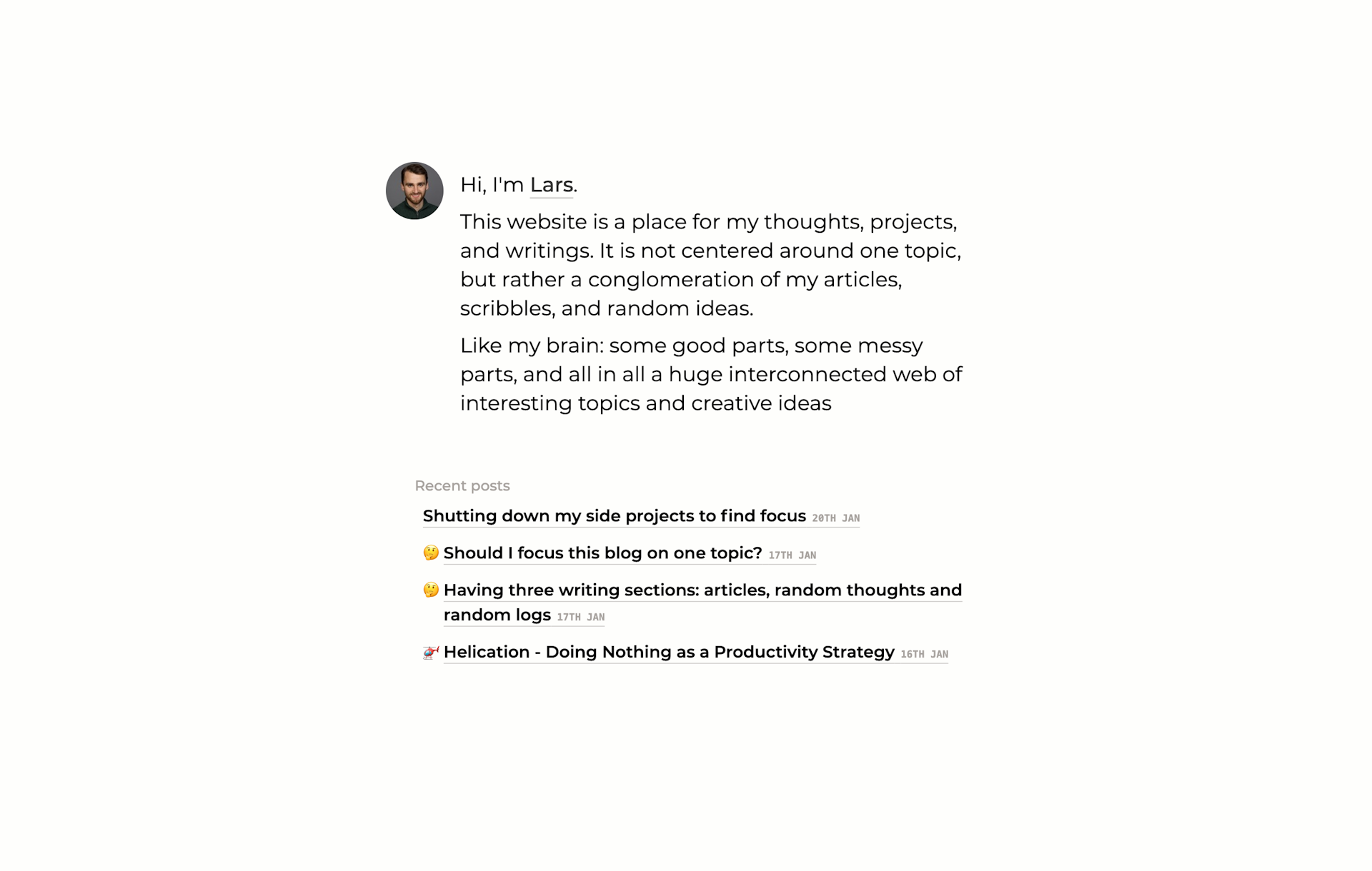
Icons. I get inspired by Notion. The small icons next to articles gives them more life, and makes the whole thing feel more interactive, for some reason.
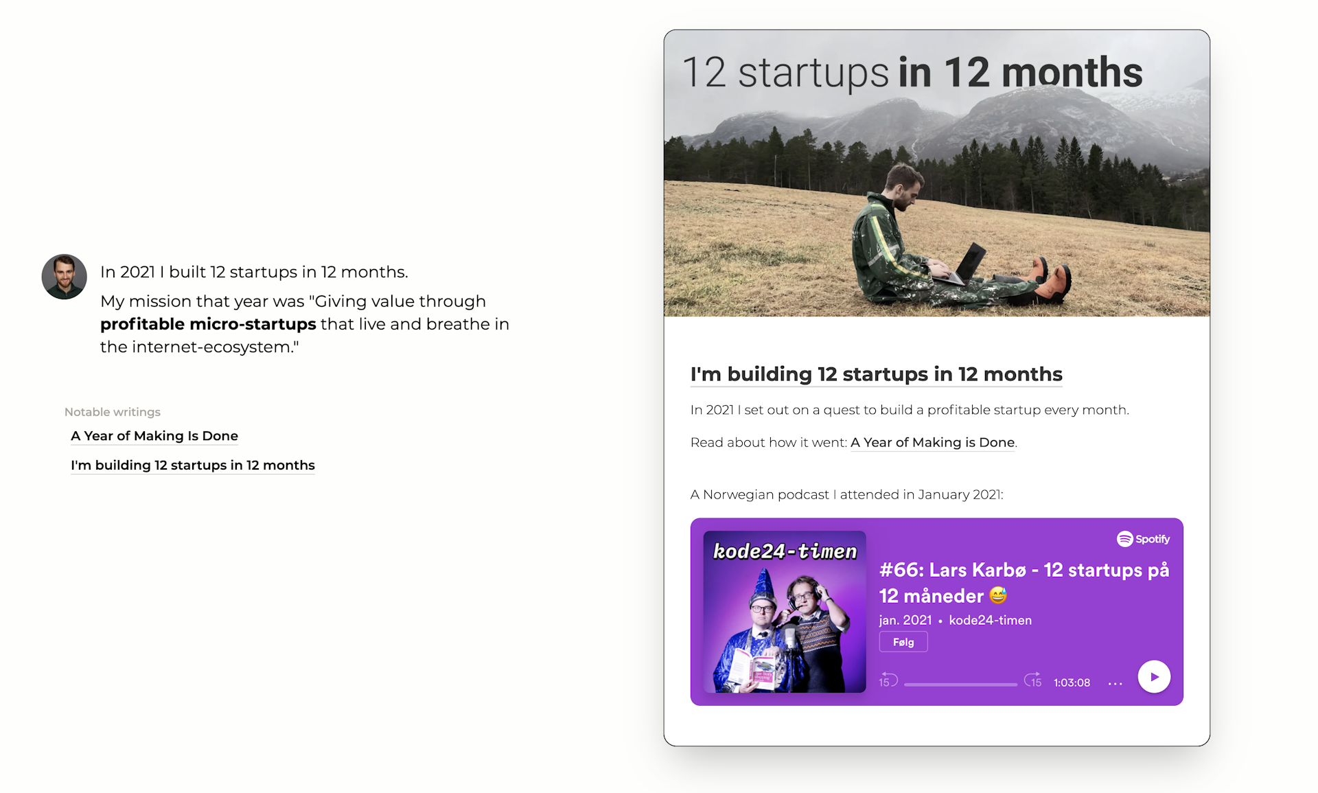
Clean article view. The article styling should make reading as easy as possible. The article design should be clean and user friendly. Don’t get in the way.
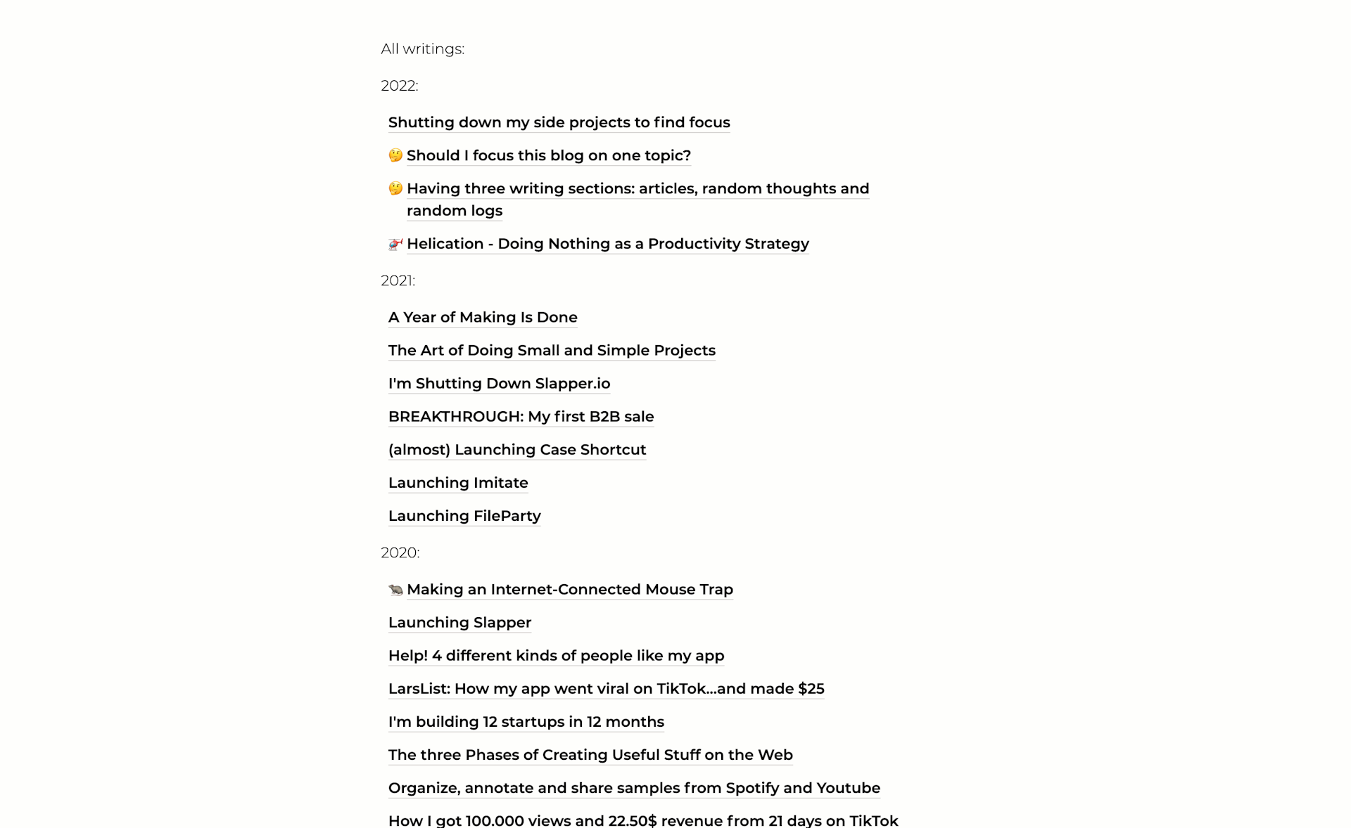
Front page overview. I’d like a nice way to show an overview over the content on the front page. Maybe I’ll make a organized web structure optimized for desktop screens? I’ll see.
Work in progress
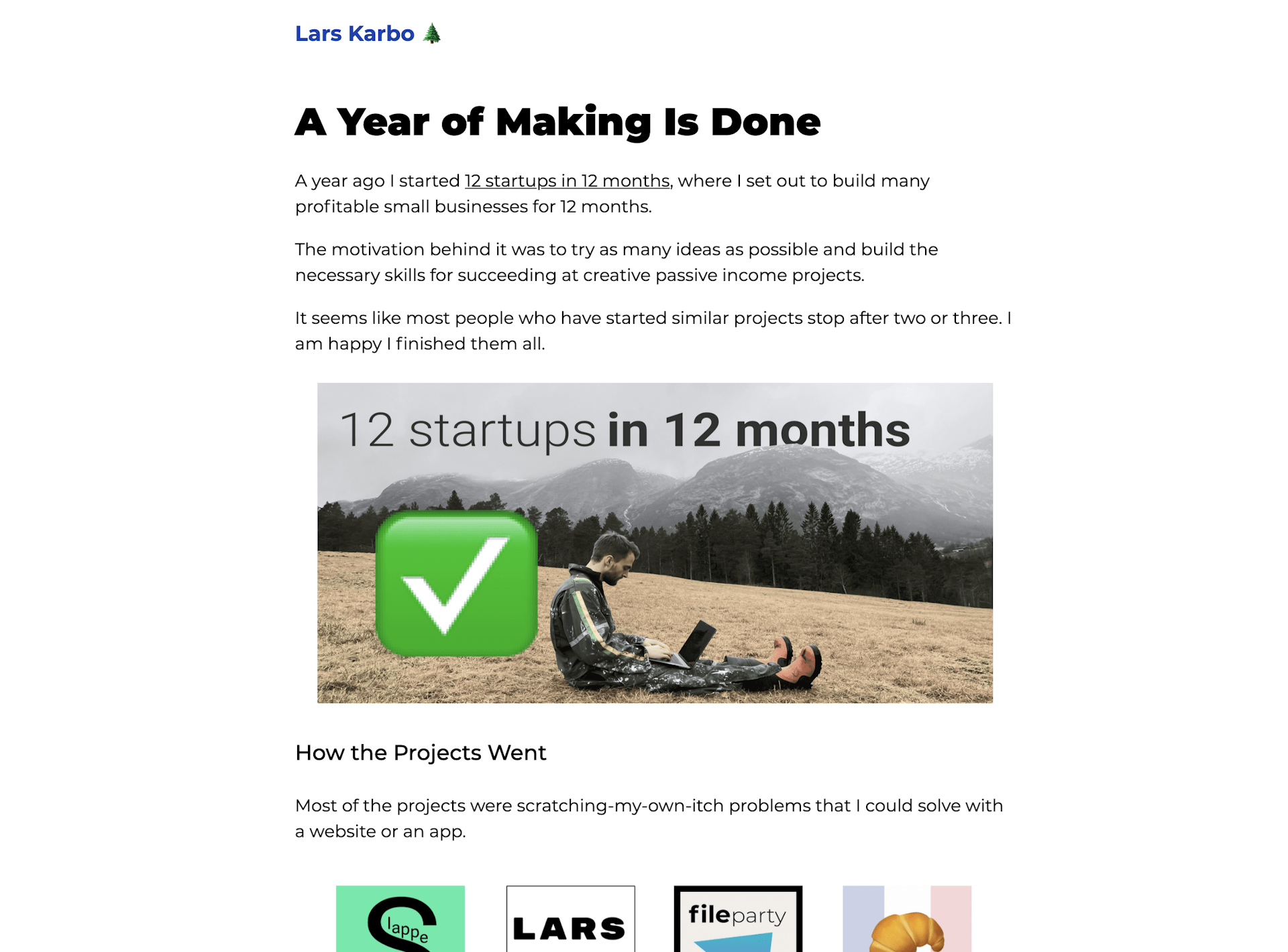
I decided to make the blog simplistic like this:
And when you scroll down, it feels like a timeline. I’m pretty happy with how the 2021 - 12x section turned out.
And then I just put links to all articles on the bottom.
Simple and ok.
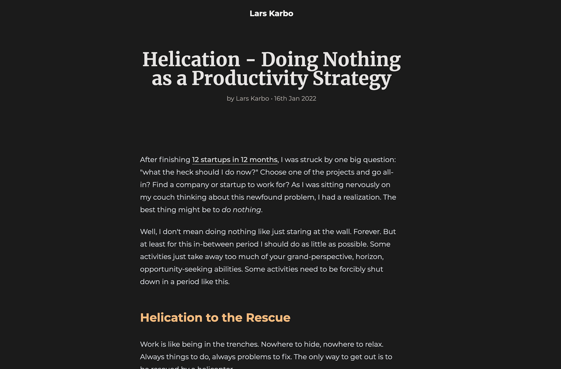
Article view looks like this. After using Notion for so long, I had to add emojis for articles. It just feels so unnatural to not have it.
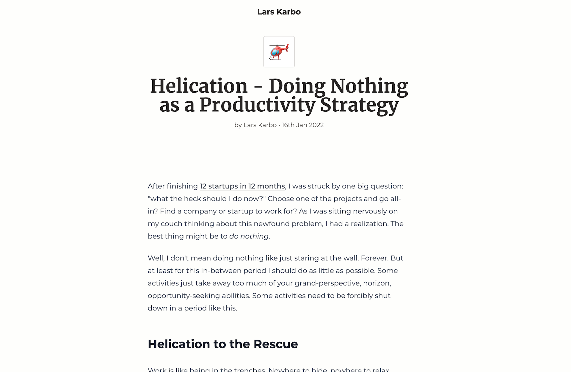
And I even added a dark mode theme. It is based on your system dark mode settings.
Conclusion
Design does not matter, but unique design and good content can make the site memorable. I have created a little corner of the internet now that I feel comfortable and at home in. Would love to write and create this space further now.